You have a beautiful website. Traffic is coming in. But the phone isn’t ringing, the leads are not coming in, and the contact form is gathering dust. You wonder what is going on? Often, it’s not a big thing, but a series of small, frustrating mistakes that sabotage your hard work. Very much like a domino effect. For businesses in competitive markets like Southeast Asia, these errors are especially costly. As a business owner, these are the types of mistakes you cannot afford to make.
Let’s diagnose the most common conversion killers so you can fix them and turn browsers and visitors into high-paying clients. Inaaya Digital is here to help you mend your website when it has these mistakes: –
1. Confusing navigation buttons
If a visitor can’t instantly understand what you do and how to find it, they’ll leave. Using clever but vague menu labels like “Solutions” or “Our Ecosystem” instead of clear ones like “Services,” “Pricing,” or “Contact Us” creates friction.
Fix: Use simple, intuitive language. Test your navigation on someone unfamiliar with your business. A lucid and easy language will help you much more than a jargon will.
2. No Clear Value Description Above the Fold
“The Fold” is what users see before scrolling. If this prime real estate is filled with generic stock photos and vague taglines instead of a clear statement of who you help, what problem you solve, and why you’re different, you’ve lost them.
Fix: State your core offer in a compelling headline within 5 seconds. “We help Dubai restaurants increase online orders by 40%” is better than “Welcome to Delicious Solutions.” Your site visitor needs to get a clear understanding of what you have to offer them.
3. Weak or Missing Call-to-Action (CTA) Buttons
A website without clear CTAs is a tour without a guide. Visitors need to be told what to do next. Buried, small, or passive CTAs like “Click Here” are ineffective. If not told what, when, and how to get forward with the purchase, it will leave your potential customer perplexed.
Fix: Use action-oriented, benefit-driven language on the buttons. “Get Your Free Sample today,” “Book a Consultation now,” “Download the Guide.” Place them strategically throughout the page.
4. Lengthy, Intimidating Contact Forms
Asking for 10 fields of information (phone, company, address, etc.) on a first contact is a huge barrier. It screams, “I’m going to spam you or call you relentlessly.” It scares the user who is a first-time visitor to your site.
Fix: Start simple. For initial leads, often just names, email, and messages are enough. You can gather more details later. Clearly state your privacy policy. For sending follow-up emails and newsletters, the email and phone number are more than enough.
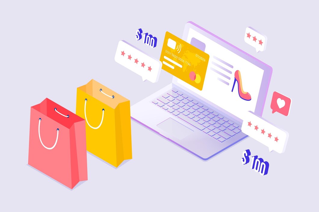
5. Ignoring Social Proof & Trust Signals
In today’s interconnected markets, visitors look for validation and credibility. A site with no testimonials, client logos, case studies, or security badges (SSL, payment gateways) feels risky and unsafe. Social proof is an important aspect of human psychology, that explains why reviews are important.
Fix: Feature genuine testimonials with names and photos (or company logos). Showcase awards, certifications, or notable press mentions prominently. This will motivate prospective clients.
6. Slow Page Speed
Every second of delay increases bounce rate dramatically. A slow site annoys users and is penalized by Google. It’s the fastest way to lose a potential customer. Read our blog on ‘How slow page speed impacts sales and SEO’ here.
Fix: Compress images, use a caching plugin, and invest in good hosting. Regularly test speed using Google Page Speed Insights.
7. Not Optimizing for the Local Audience
For UAE/Singapore businesses, generic, globalized content misses the mark. Not displaying local currency (AED/SGD), contact numbers with the correct country code, address, or culturally relevant imagery creates disconnect.
Fix: localize your content and site, make sure you cater to your target audience and build that trust. Mention neighborhoods you serve, use local testimonials, and ensure your content speaks directly to regional pain points and opportunities.
Conclusion: Your website is a system, not a brochure. Every element must work together to guide a visitor toward a single goal. Audit your site today with us. Remove friction, build trust at every step, and make the next action blindingly obvious. At Inaaya Digital, we fix these mistakes not just by tweaking a website; it’s unlocking a pipeline of qualified leads so that your website sells even when you chill!